To outline the essentials of web application UX design is hard since it involves many contents, including design principles, interaction mode, screen pattern, navigation, workflow, visual design, theme, components, color palette, icon pattern, graphic, i18n and accessibility etc.
I would draft this based on my experience worked on a few large scale web application projects. This can be a great start point if you want to create a UX solution design for a web application.
Design principles: User-centric, know what user wants and support users their way.
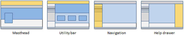
Common interaction elements: masthead, utility bar, navigation, content pane, help drawer, footer, modal and notifications.
Navigation can include masthead and sub-navigation menu. Masthead represents the overall structure of the application, including logo, main functional module list, i18n, accessibility and help links, etc. Utility bar contents user specific functions, such as account, cart, search, sign out, etc. Sub-navigation menu is based on the functionality and logical workflows of the web application.
Page flow design defines the logic context relationship among pages, based on user persona and user stories. Pages can be accessed by order based on navigation menu, train component, or next link – when certain conditions are met in current page, user may reach next page.
Screen patterns serve as templates that can display variations in content across multiple appearances in the design while ensuring a consistent visual appearance.
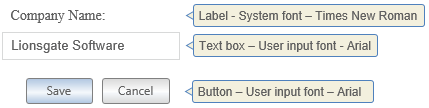
Visual design integrates themes in typography, color, grid, iconography and graphic illustrations to support user experience. Page grid defines page gutter, column gutter, component width and height. Typographic design uses at least two types of fonts to create a consistent visual hierarchy, to present the voice of the system and the user.
Color scheme is used to provide a consistent user experience and orientation. Base colors can be used to differentiate each functional module of the web application. Analogous colors which are expanded from base colors can be used in according context. Pictographic icons and graphic illustrations are designed for UI components. Both colors should be well-aligned with the overall color scheme design in different functional modules.
Accessibility design is based on a few guidelines, including Web Accessibility Initiative (WAI) and Web Content Accessibility Guidelines (WCAG) and Accessible Rich Internet Applications Suite (ARIAS), etc. Accessibility design includes a few design improvements, such as improving color contrast, including Skip to main content feature, improving required fields and page alerts, etc.
Responsive design is mainly for mobile devices, such as tablets and smartphones. It uses fluid grids, flexible images, media queries and responsive layouts to adapt to different screen sizes of mobile devices. It becomes more important when many companies have mobile first in their digital strategies.
Lionsgatesoft.com consultants have rich experience in UX design and enterprise application integration. We contributed to ObamaCare HIX (Oracle WebCenter Portal, Portlet, ECM, EAI), BCHydro.com (Adobe AEM / CQ, EAI), HydroWeb (Adobe AEM / CQ), BCLiquorStores.com (Drupal, web services), Should you have any questions, please feel free to contact us.